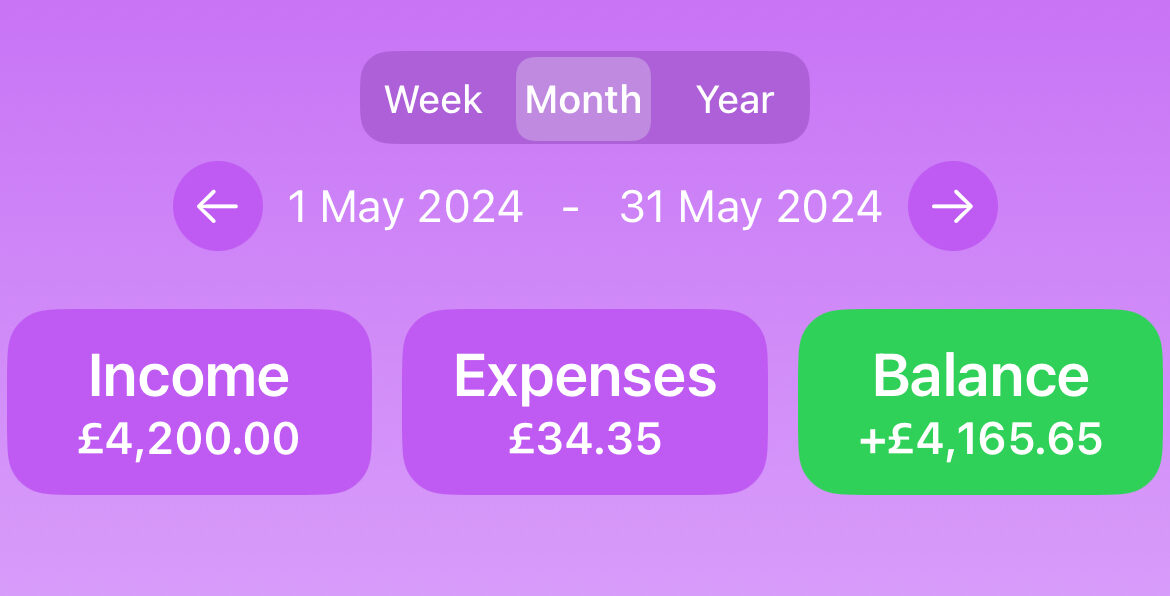
In modern app development, creating reusable components is essential for building scalable and maintainable applications. In this blog post, we’ll walk through the process of creating a reusable SwiftUI view for selecting a date range based on a specified duration type (week, month, year) and incorporating buttons to navigate to the previous or next date range.
We’ll start by defining our reusable DateRangeSelectorView and then demonstrate how to integrate it into a parent view to show its usability. You can use this reusable component to any of your apps that allows filtering of data based on duration.
DateRangeSelectorView Implementation
Here’s the complete code for DateRangeSelectorView. This view allows users to select a date range and navigate between different ranges using “Previous” and “Next” buttons. When the view is loaded for the first time, default date range selected is current month start and end date.
import SwiftUI
import SwiftData

struct DateRangeSelectorView: View {

    @Binding var startDate: Date
    @Binding var endDate: Date
    @State var selectedDurationType: Constants.Duration = .month

    var dateRangeChanged: ((Date, Date) -> Void)?

    var body: some View {
        VStack {
            // Duration Picker
            Picker("DurationType", selection: $selectedDurationType) {
                Text("Week").tag(Constants.Duration.week)
                Text("Month").tag(Constants.Duration.month)
                Text("Year").tag(Constants.Duration.year)
            }
            .pickerStyle(.segmented)
            .frame(maxWidth: 150)
            .background(Color.appBackground)
            .cornerRadius(10)
            .onChange(of: selectedDurationType) {
                updateDateRangeAndNotify(direction: nil)
            }
            .onAppear {
                updateDateRangeAndNotify(direction: nil)
            }

            // Date Range Display
            HStack {
                // Previous Button
                ZStack {
                    Circle()
                        .foregroundColor(.appBackground)
                    Button(action: {
                        updateDateRangeAndNotify(direction: Constants.Direction.backward)
                    }) {
                        Image(systemName: "arrow.left")
                    }
                    .foregroundColor(.white)
                }
                .frame(width: 30)

                // Start and End Dates
                Text("\\\\(startDate.formatted(date: .abbreviated, time: .omitted))")
                Text(" - ")
                Text("\\\\(endDate.formatted(date: .abbreviated, time: .omitted))")

                // Next Button
                ZStack {
                    Circle()
                        .foregroundColor(.appBackground)
                    Button(action: {
                        updateDateRangeAndNotify(direction: Constants.Direction.forward)
                    }) {
                        Image(systemName: "arrow.right")
                    }
                    .foregroundColor(.white)
                }
                .frame(width: 30)
            }
            .font(.system(size: 15))
        }
        .frame(alignment: .center)
        .cornerRadius(10)
    }

    private func updateDateRangeAndNotify(direction: Constants.Direction?) {
        if direction == .forward {
            let nextDateRange = AppUtil.getNextDateRange(forDuration: selectedDurationType, forDirection: .forward, usingStartDate: startDate, usingEndDate: endDate)
            startDate = nextDateRange.nextStartDate
            endDate = nextDateRange.nextEndDate
        } else if direction == .backward {
            let previousDateRange = AppUtil.getNextDateRange(forDuration: selectedDurationType, forDirection: .backward, usingStartDate: startDate, usingEndDate: endDate)
            startDate = previousDateRange.nextStartDate
            endDate = previousDateRange.nextEndDate
        } else {
            let currentDuration = AppUtil.getCurrentDurationStartAndEndDates(forDuration: selectedDurationType)
            startDate = currentDuration.startDate
            endDate = currentDuration.endDate
        }
        dateRangeChanged?(startDate, endDate)
    }
}

#Preview {
    DateRangeSelectorView(
        startDate: .constant(Date()),
        endDate: .constant(Calendar.current.date(byAdding: .day, value: 6, to: Date()) ?? Date())
    ) { newFromDate, newToDate in
        print("Date range changed: From \\\\(newFromDate) to \\\\(newToDate)")
    }
}
Integrating DateRangeSelectorView into a Parent View
To demonstrate how to use DateRangeSelectorView, we’ll integrate it into a parent view. This example shows how to manage the selected date range and respond to changes.
import SwiftUI

struct ContentView: View {

    @State private var startDate: Date = Date()
    @State private var endDate: Date = Calendar.current.date(byAdding: .day, value: 6, to: Date()) ?? Date()

    var body: some View {
        VStack {
            Text("Select Date Range")
                .font(.title)
                .padding()

            DateRangeSelectorView(startDate: $startDate, endDate: $endDate) { newFromDate, newToDate in
                print("Date range updated: From \\\\(newFromDate) to \\\\(newToDate)")
            }
            .padding()

            Spacer()
        }
        .padding()
    }
}

struct ContentView_Previews: PreviewProvider {
    static var previews: some View {
        ContentView()
    }
}
Explanation
- Picker for Duration Type: The picker allows users to select between week, month, and year durations. When the selection changes, the date range is updated accordingly. Selection of duration type recalculates dates based on current date and duration time selected.
- Date Range Display: This section displays the current start and end dates and provides “Previous” and “Next” buttons to navigate through date ranges.
- Updating Date Ranges: The
updateDateRangeAndNotifyfunction handles updating the date range based on the selected duration and the navigation direction (previous or next). It uses helper services (AppUtil) to compute the new date ranges. - Integration in Parent View:
ContentViewintegratesDateRangeSelectorViewand manages the state forstartDateandendDate. It also provides a callback to handle date range changes so that the parent view can update its contents based on new date range.
Conclusion
By creating a reusable DateRangeSelectorView, you can easily integrate date range selection functionality into various parts of your SwiftUI applications. This approach not only promotes code reuse but also simplifies the management of date ranges within your app. Happy coding!


